SightKnight
SightKnight is a new automotive brand selling car visors. They’re a brand focused mainly on selling through the online channels like Amazon.
Background
A company approached us to brand a product they wanted to market. Selling on the North American market, we were asked to completely develop the entire brand.
Strategy
Most brands on the automotive market don’t have a very up-to-date brand. Which is strange, because the type of car owners that would install a car visor are people in general sensitive for strong brands. The names of the competitors in the niche are actually very hard to remember and don’t really stick. It made it rather easy for us to come up with a catchy name. It seems that the competition of the brand is mainly focused to male customers above a certain age. We however believe the product is equally suitable for other demographics. Therefore we looked for a more widely appealing design and brand approach. The idea is to appeal to the fun part of driving: road tripping, and the sense of freedom that comes along with it.
Concept
We came up with the name SightKnight, because the product is like a white knight coming to the rescue for protecting the driver’s (and passenger’s) eyesight while in the car. That’s because road fatigue is a real and serious issue happening to everybody out there. Also the design should have a lot of clarity. That’s because – in essence – that’s the commodity SightKnight is actually providing: a clearer vision. The SightKnight car visor is intended for use during daytime and nighttime and we wanted this to be reflected in the design as well.
Design
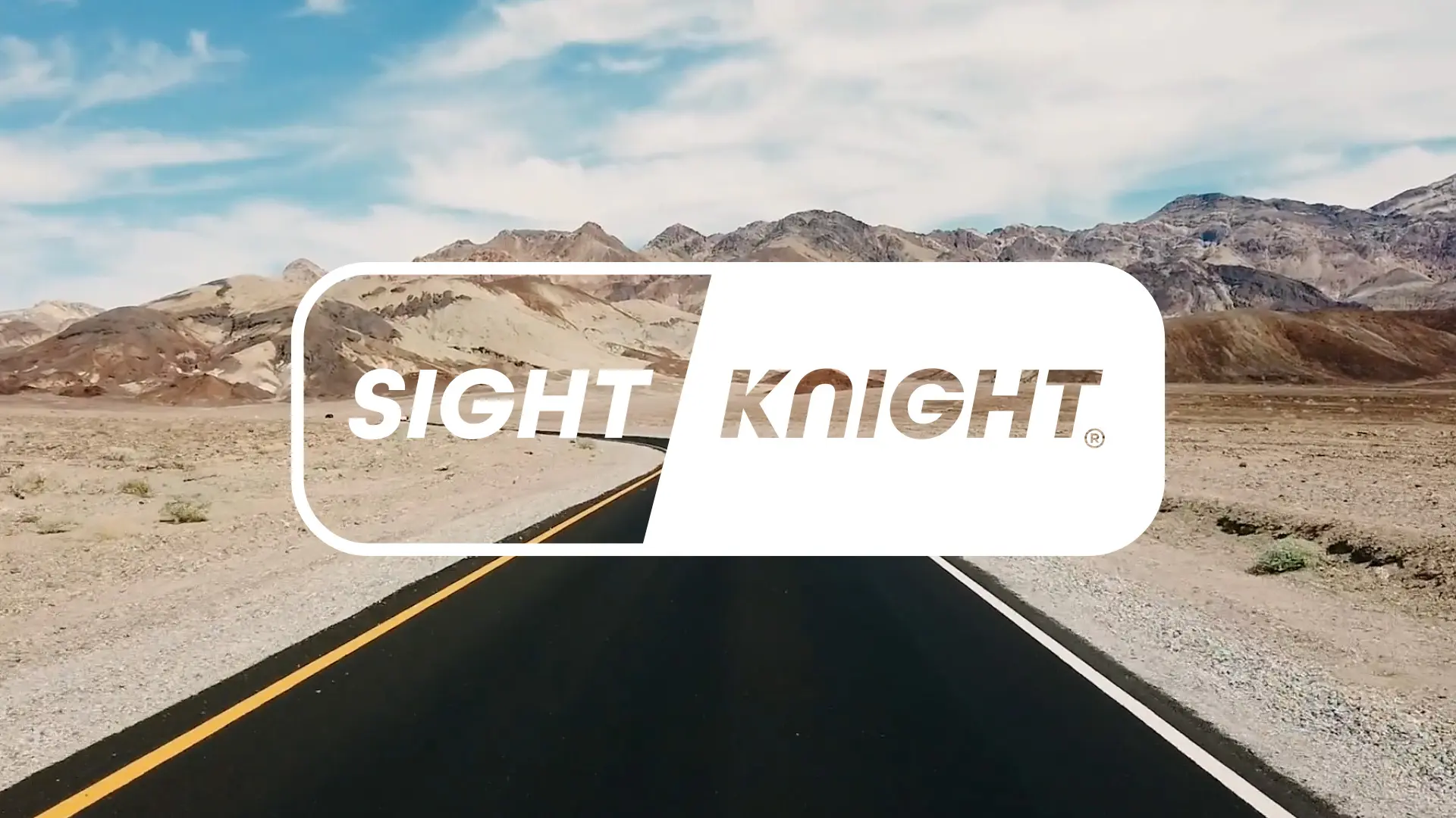
The design evolves around clarity and safety. The color blue was seen as best representing this, but in many cases we chose to place the white logo over road tripping imagery. We believe this creates the sense of freedom and discovering new places that actually makes driving fun. We decided to make a double logo that expresses the day and night automotive feature of the brand, where one side of the logo is imposed on an inverted version of the other side. At the same time the logo resembles the actual shape of the car visor itself.
Conclusion
In the end we’ve come up with the name, payoff and overall campaign to position SightKnight in the market. And made SightKnight stand out as clearly one of the most professional brands in its niche.


